Dr Pickles.
Personal Care · Tattoo Aftercare Rebrand
Dr Pickles had built a loyal following with tattoo artists and the people who love their ink. The brief was to take that loyalty and translate it for mainstream pharmacy. A brand that earned its place in tattoo studios needed to earn its place in Chemist Warehouse, without losing the credibility that got it there.
From tattoo studio to pharmacy shelf.
Tattoo aftercare lives in two worlds. The specialty world. Where credibility comes from artists, recommendations, ink studio shelves. And the mainstream pharmacy world. Where credibility comes from category codes, recognisable typography, and shelf trust. The brand needed to read confidently in both without compromising either.
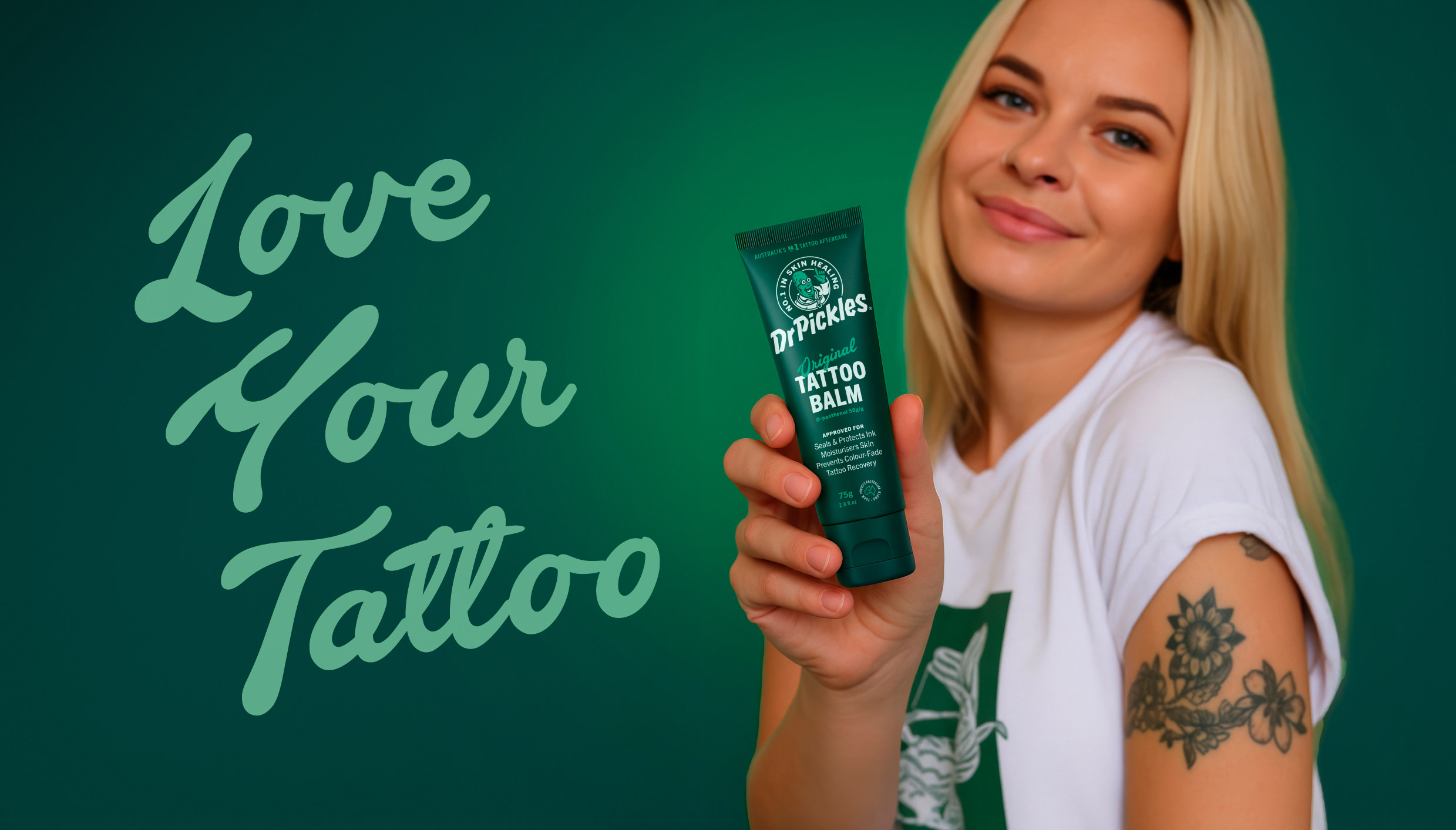
Lean into the cult. Just give it a wider gateway.
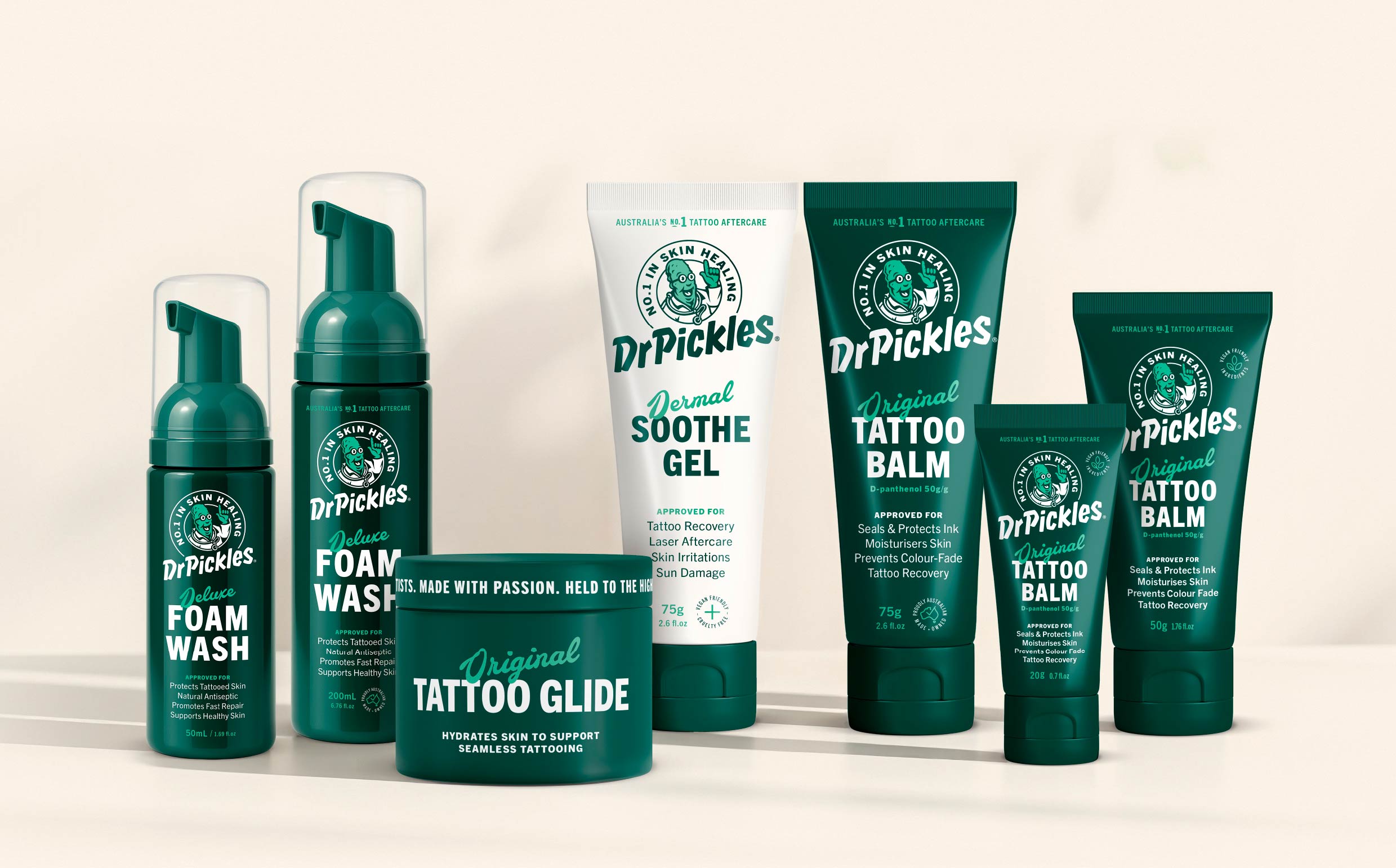
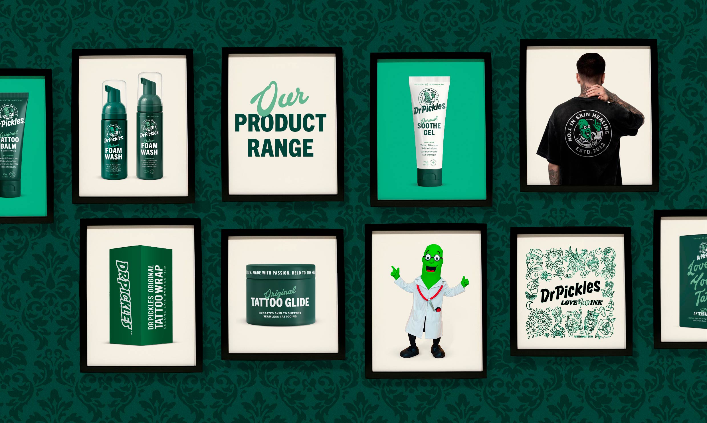
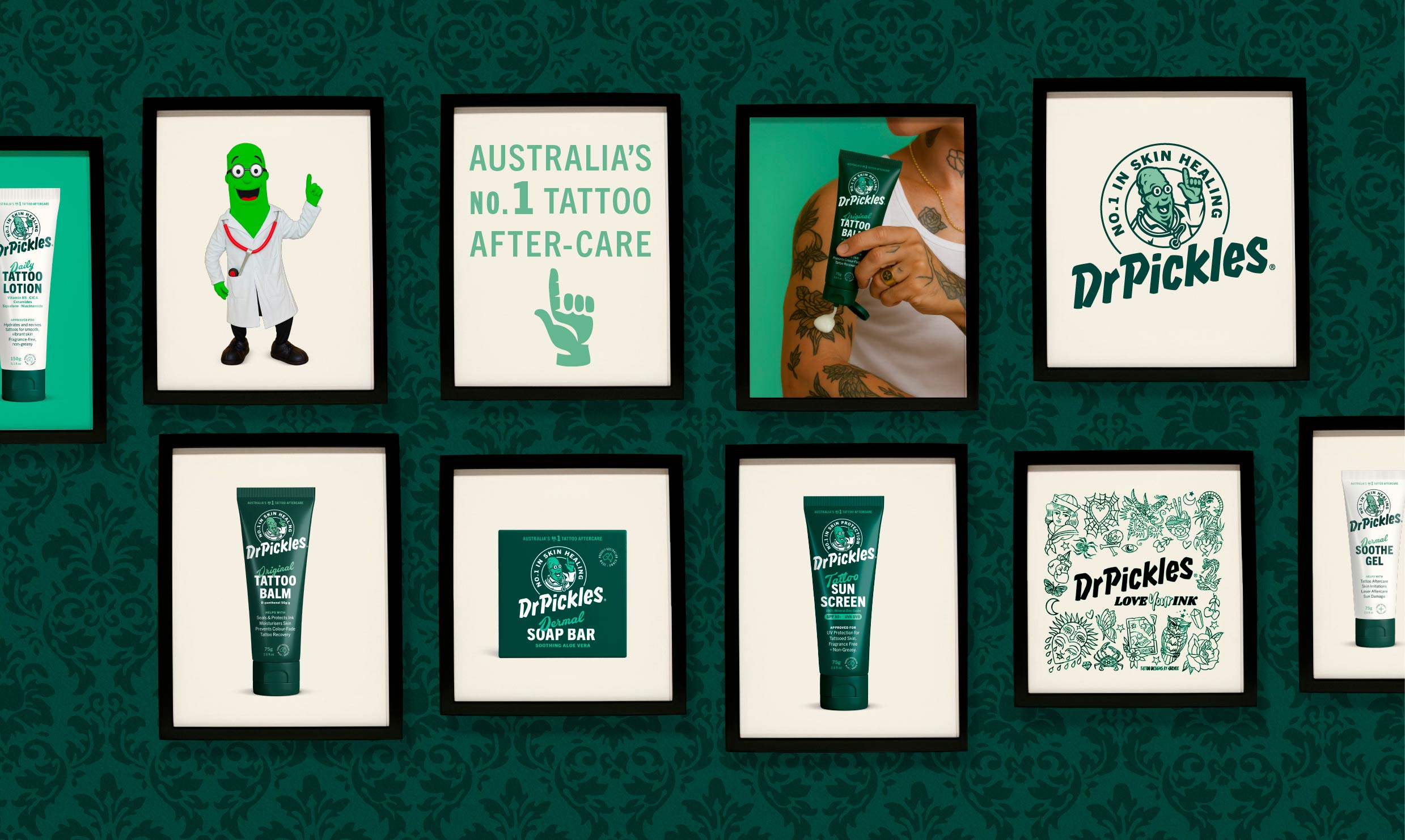
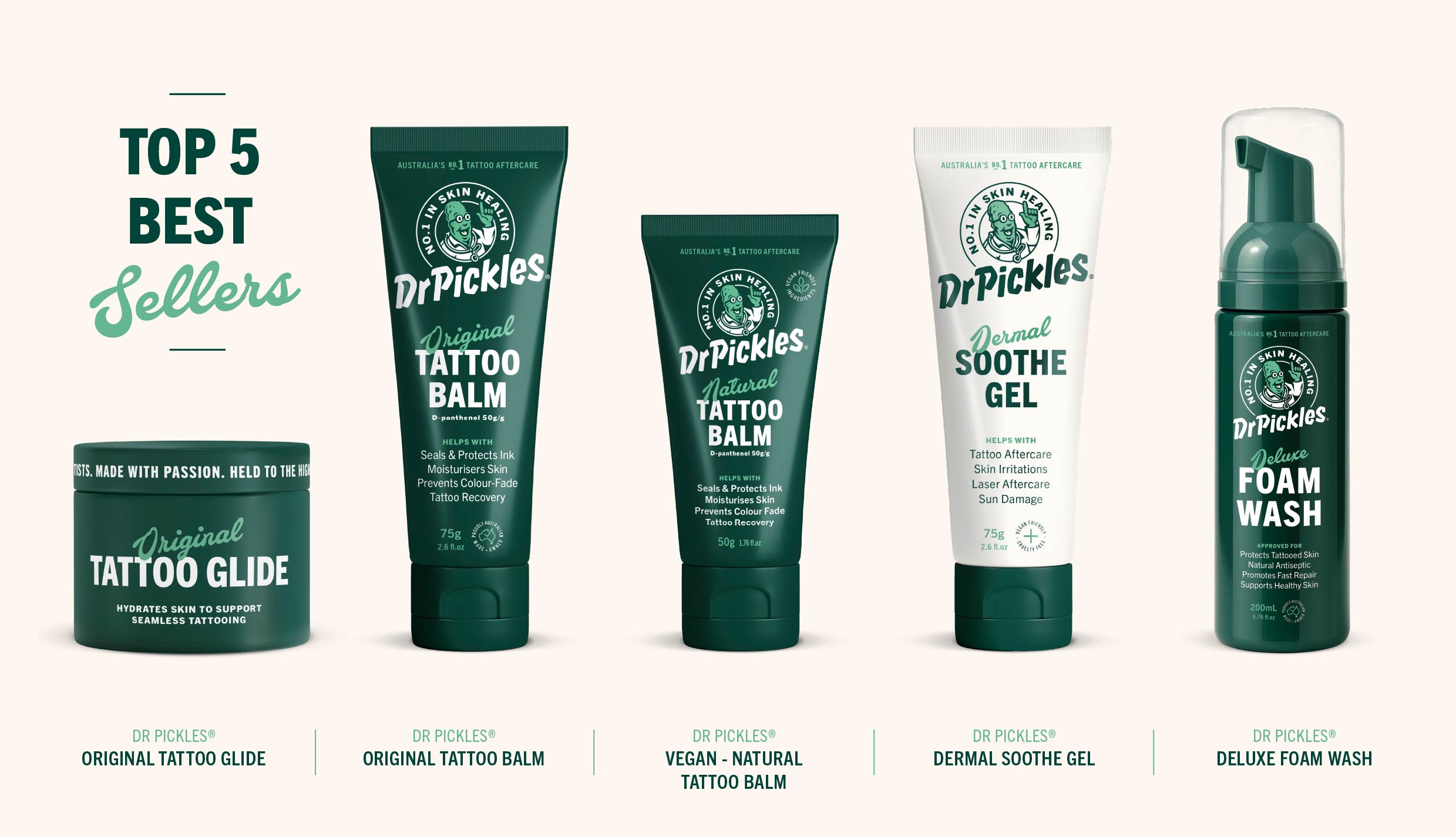
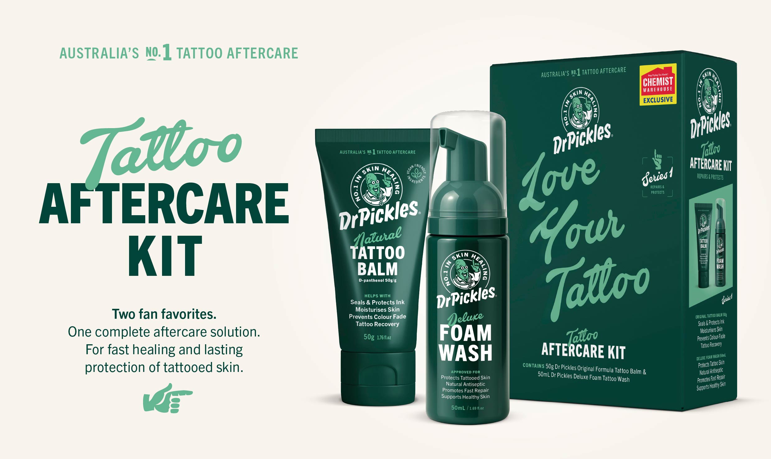
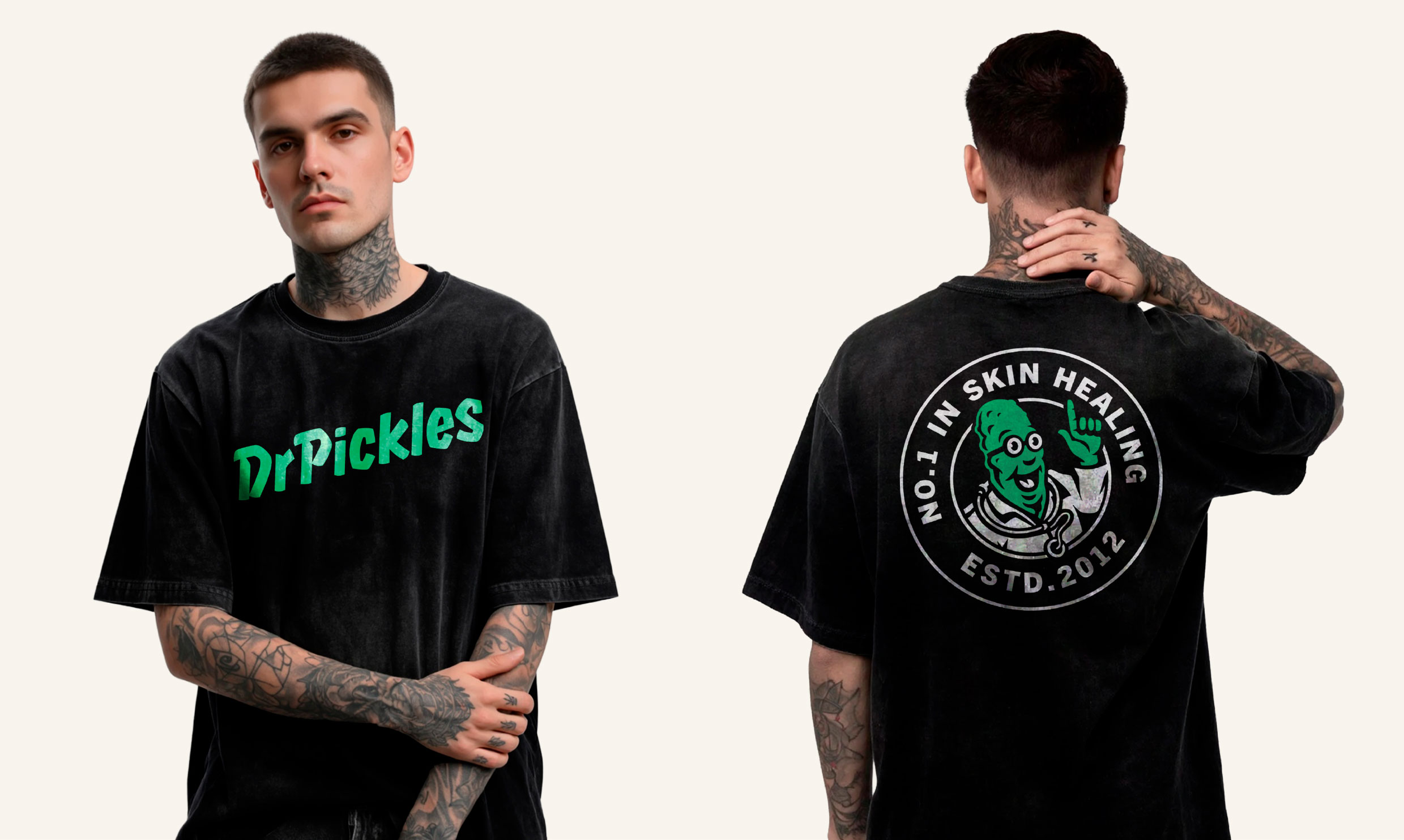
We didn't dilute the tattoo-shop heritage. We sharpened it. The Dr Pickles wordmark stayed character-led. The colour territory stayed confident. What changed was the system around it. Packaging hierarchy, range navigation, and shelf logic tuned for the pharmacy bay. Same brand. Wider audience.
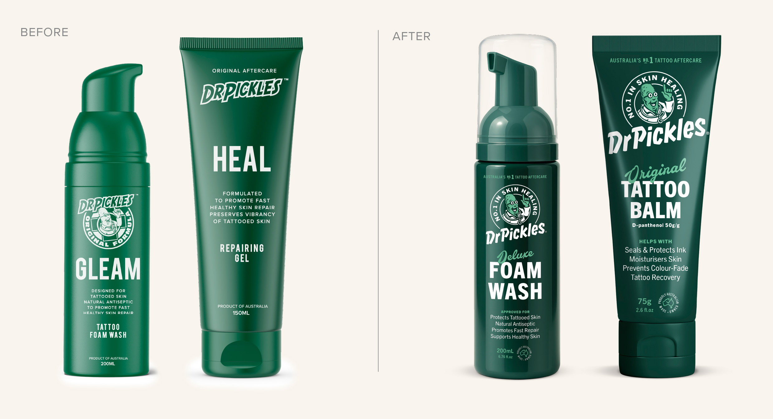
Sharpen the identity. Build the range. Run the campaign.
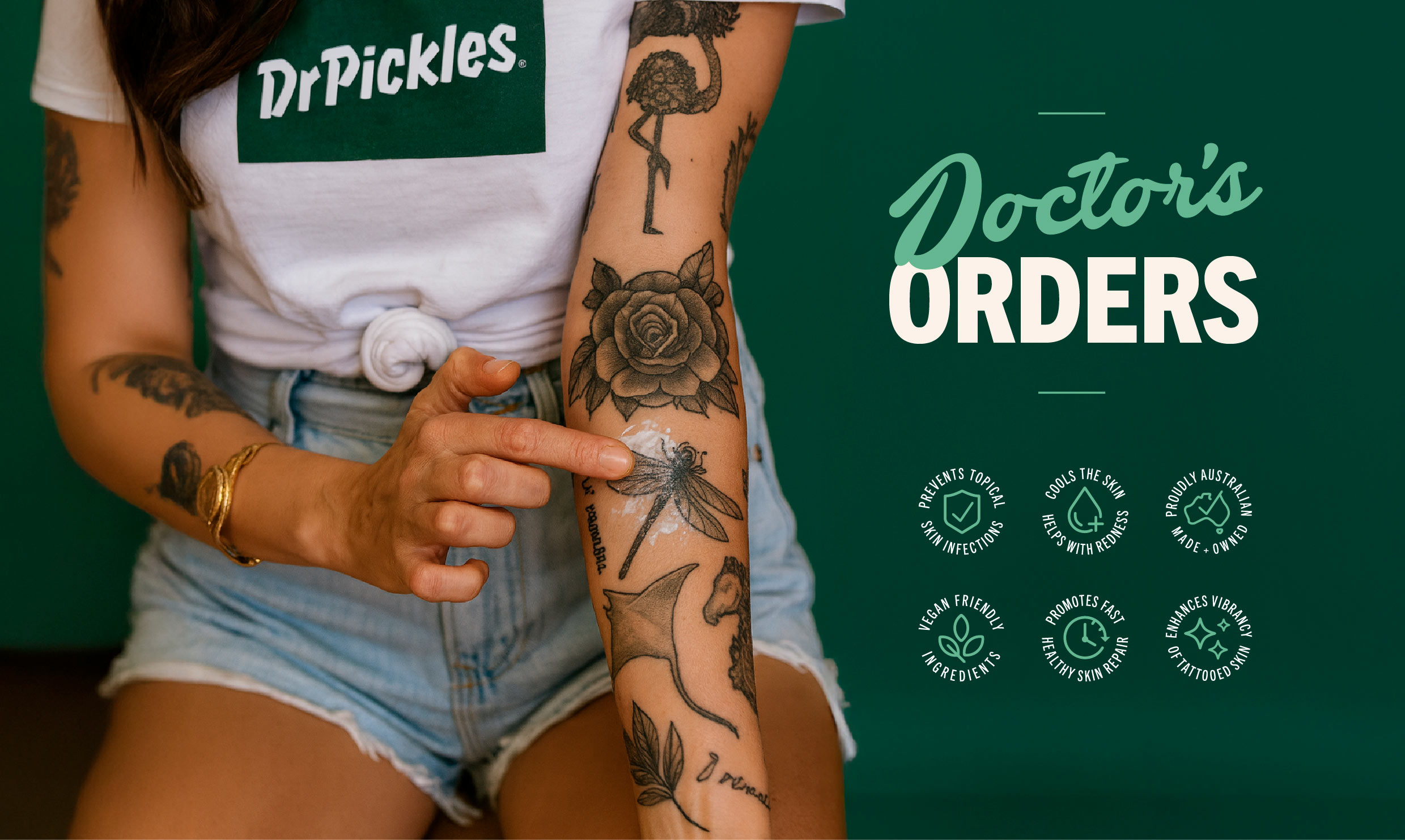
Identity refinement first. The wordmark, the colour territory, the logo system. Range architecture next. Naming, SKU navigation, format hierarchy. Then packaging. Front-of-pack and back-of-pack as a unified system that holds at shelf and in hand. Finally, campaign direction. Photography, language, the world the brand lives in.
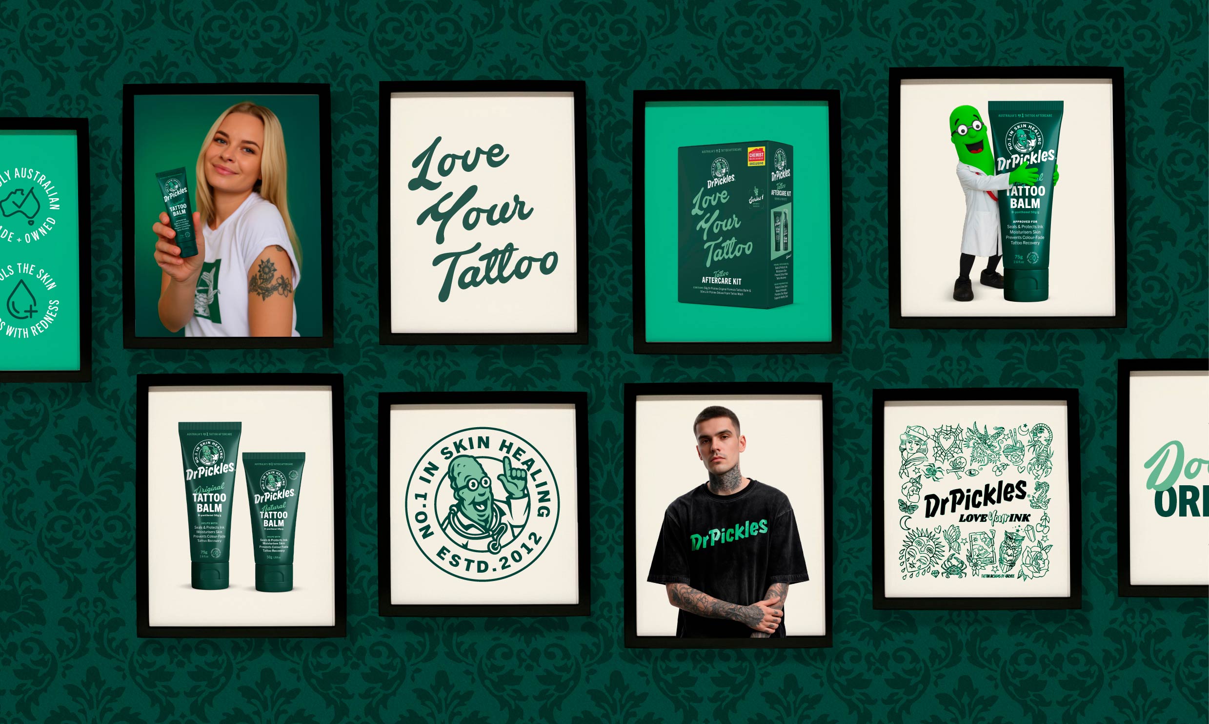
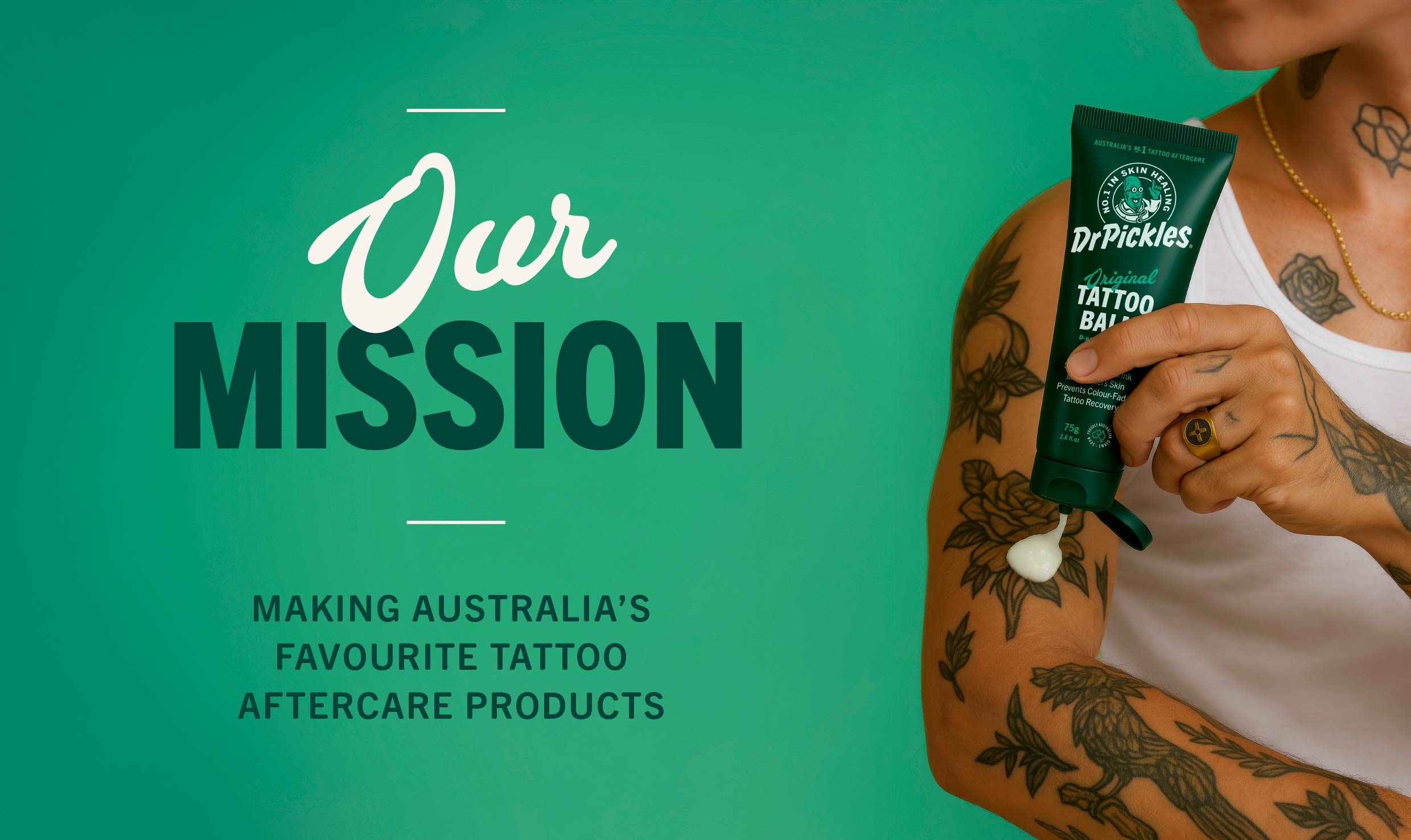
“The brands that move from cult to mainstream do it by sharpening the thing that made them cult in the first place. Not by smoothing it away.”